Another iPhone panorama, this time with the Pano app. I had been using AutoStitch, which makes panoramas from a series of existing photos. Pano takes a different approach: you shoot a series of photos, in order from left to right, from inside the app. After each image, the app asks if you’re happy with the shot, or if you’d like to retake it. If you’re happy with it, it stores it, and then shows you a semi-transparent slice of the right edge of the photo superimposed over the left side of the current camera viewscreen. This makes it fairly easy to line up each shot as you pan across your scene. When you’ve taken all the photos you want, the app joins the images together and saves it to the Camera Roll on the iPhone.
The upside to Pano is that it’s much easier to get well aligned images, as long as there’s enough contrast in the individual pictures to allow you to line them up as you’re shooting. The down side is that the only layout the app can handle is a single row of landscape or portrait shots. AutoStitch can join photos in any combination. The panorama at the bottom of my previous post (our back yard) was built from two rows of four photos (8 images total). The top row included a nicely exposed blue sky, and the bottom row was primarily the tussock–permafrost landscape of our backyard. Even though there are some obvious artifacts in the final image, it would be hard to get such a nice overall exposure with Pano and the iPhone camera.

Moose damage to the water tank
We’ve had quite a few moose encounters over the last few days. This morning I felt what I thought was an earthquake, but when I looked out the window to see what was happening, there was a bull moose next to the deck trying to work the velvet off his antlers by rubbing them on the deck stair railing. He didn’t completely tear off the railing, but he came close. Along the way he stabbed our water tank several times (you can see the damage to the foam insulation in the photo on the right), knocked over a wheelbarrow, and ripped my National Weather Service rain gage off the dog yard fence. We’d seen the same moose yesterday afternoon along the power line using a power pole support wire on his antlers.
I shot a couple videos of this morning’s action. The first one is after he started ramming the water tank. I decided I needed to go outside and scare him away before he did any more damage to the house. You can see that he thinks twice about charging me before he runs off. I thought for sure he was going to barrel right into the Jeep. Here’s the video:
The second video shows him going to town on the stair railing. This was was shot through a window, so it’s not quite as sharp:
It’s only a couple days from moose season. We live in a bow-only hunting area, but the regulations here allow bow hunters to take any male with more than a “spike/fork” set of antlers (meaning a little antler spike on one side of his head and a forked antler on the other side). This moose is much larger than that. I’m not sure if he’d be legal in a typical hunting area where hunters can shoot any moose with more than a 50” antler spread, but he’s close.
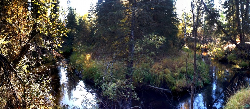
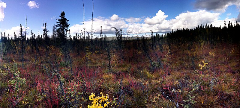
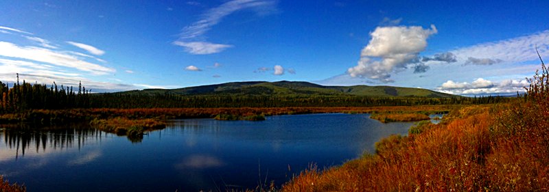
Hunting season means cool temperatures, lots of sun, and gorgeous colors. Here’s an iPhone panorama shot of our back yard:
Across from the office is a protected area that was the site of a some sort of resource extraction. It’s a nice spot to take a break at lunchtime, and I enjoy walking Nika and Piper on it in the winter (or around it when it’s not frozen). The hill in the distance is Ester Dome, the high point of the Equinox Marathon that Andrea will be running in a few weeks.
The photo was constructed from three photos using an iPhone app called AutoStitch. I’ve done this process on my Mac using Hugin, and it works well. But AutoStitch can do the whole process right on the iPhone, now has a cropping feature to trim off the extraneous curvature at the edges, and does the whole thing with almost no effort on the user’s part. Very slick.
Last night a pair of young moose showed up in our driveway. Andrea and I went out on the deck and shot some iPhone video of their antics. At one point (see the video below) Deuce went over to the fence and the moose ran over to check him out. It was clear that Deuce was trying to play, but I’m not sure what the moose were thinking.
The iPhone shoots QuickTime movies; the new HTML5 web standard will include a video tag that indicates to a browser that the file is a video. Firefox 3.5 is the first browser to implement this tag, playing Ogg Theora videos without needing an external video plug-in like Flash or Silverlight or whatever. This is a good thing because it means web developers can stop developing their sites with a bunch of proprietary languages and formats just to show a video.
Unfortunately, getting a QuickTime video from the iPhone into the right format is a bit of a pain, and even after I got it all figured out, the video wouldn’t play once I uploaded it to my hosting provider. But in case it’s useful, here’s the procedure I used. I suspect the ffmpeg2theora step could probably have been done on my Mac, but it doesn’t appear to be part of fink so I just installed it on my Linux box and ran it there.
- Drag MOV file onto the New Event icon in the upper left pane of iMovie
- Crop and select time period in the movie in the middle frame
- Create a new project (which appears in the lower left pane)
- Drag the selection from the upper middle frame to the lower middle frame
- Export the movie at Medium quality
- Transfer to Linux
- Run ffmpeg2theora -v 5 -x 350 --aspect 16:9 moose_test.m4v (choosing the proper aspect ratio and size)
In my previous post on my weather station I included a graph of the relationship between the three temperature sensors I’m collecting data from. It turns out that the plot is incorrect because I had messed up the program that converts the raw data from one of my Arduino stations. What became clear after looking at the (fixed!) data is that the enclosure I built isn’t adequate at keeping the sensors cool when in direct sunlight. I could probably improve the design of the enclosure somewhat, but I decided to aspirate the sensors instead.
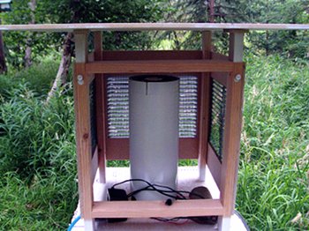
The photo on the right shows the inside of the enclosure. The sensors are sitting on a platform inside the pipe, and there’s a small muffin fan (the kind you’d use to vent a computer case) on the top. It’s a 12V fan, and at the moment it’s being driven by a 9V AC/DC converter. The plan is to replace the converter with a 12V solar cell that is sufficient to drive the fan. This way it doesn’t consume any electricity, and the fan is only spinning when it’s necessary (when the sun is out). Thus far, I haven’t found a suitable solar panel. The small ones designed to charge a cell phone battery don’t operate at the correct voltage (and probably don’t produce enough current anyway), and the big ones designed to keep a car battery charged are expensive and overpowered for my needs. With winter rapidly approaching, I’ve got plenty of time to figure something out.
The pipe is a piece of 4” sewer pipe that’s been spray painted white and has a series of holes drilled into the bottom. The fan pulls air up through these holes and over the sensor array in the middle. If I had it to do over again, I’d cut the pipe a bit shorter so it’s not so difficult to get into the enclosure. But for keeping the sensors bathed in atmospheric air, it works quite well.
Temperature summary, effect of aspiration
The plot shows the observed temperature for each of the three sensors I’ve got. The blue line is the “west” sensor that’s inside the enclosure I built and is the subject of this post. The red line is the reported temperature from the Rainwise station that sits atop a post attached to the dog yard gate. The green line is the sensor that’s behind the house and under the oil tank. I built the enclosure for the west sensors on July 12th and installed it that evening. You can immediately see the effect of the shielding during the high temperature peak on the 13th. But you can still see the two little peaks that are present in the previous plots. These peaks come from direct sun on the station, split by some trees that shade the station for an hour or two.
On the evening of the 13th I installed the pipe and fan. It was smoky on the 14th and cloudy on the 15th, but you can see the effect of the fan on the following dates. The double peaks are now gone, and the temperature from the west sensors at the high point during the day is now a few degrees cooler than the measurement from the Rainwise station. Also notice that all three sensors are virtually identical on the 15th when it was cloudy and raining.
What this demonstrates to me is that the aspirated west sensor is now the best reference sensor for our site. The Rainwise sensor is a close second, but it’s Gill multi-plate radiation shield isn’t as effective as my aspiration system at reducing the effect of solar heating on the station.


