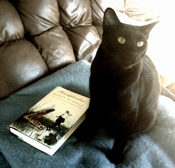
Jenson’s yawn pretty much summarizes my feeling about this book. The main character has convinced himself he needs to murder someone to avoid stabbing his child with an ice pick. He carefully plans how he’d do this but when he gets a prostitute who will serve as victim, she’s as damaged as he is. Much of the story concerns the back and forth as these two damaged individuals try to figure out what is going on with the other. My problem was that I really felt no investment in any of the characters and the whole premise seemed really unlikely.
One good thing: the book was short.

Tim Lincecum and the Giants
Yesterday was opening day in Major League Baseball. Yahoo!
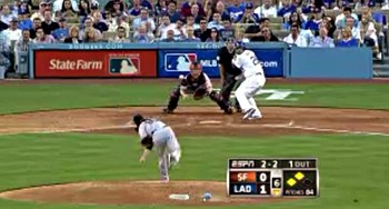
I watched bits of Tigers v. Yankees, Padres v. Cardinals, and much of the Giants v. Dodgers game, all on my iPhone. I haven’t subscribed to MLB.tv, but yesterday’s games were sponsored by Volvo, so anyone with the MLB 11 app could watch for free. The quality is reasonable, and the app seems smart about not consuming all the available bandwidth.
I root for the A’s, Giants and Phillies (and favor the Tigers and Cubs when there are no other rooting interests). All three are pretty good teams, and all of them have the starting pitching to contend, but may have trouble scoring runs. The A’s have no power threat and a cadre of fragile, replacement-level position players, the Giants need a good season from Posey, Sandoval and rookie Brandon Belt, and the Phillies are hurting without Werth and Utley. But however it turns out, it’s great to have baseball back.
Well, however it turns out as long as the Yankees, Angels, Braves and Dodgers don’t wind up in the World Series…

Deuce and Vixen
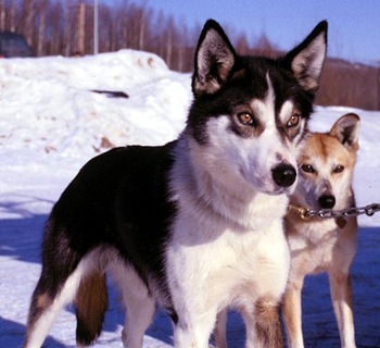
Photo by Andrea Swingley
Deuce died today from liver failure probably caused by a problem with his bile duct or gall bladder. He was just shy of fourteen years old and was a very healthy dog except for a having a toe removed a few months ago due to a slow growing tumor and an incident a couple years ago where he somehow managed to break his tail (!?).
Dusenberg (he came from a litter named after luxury cars) was our first sled dog and our second dog after Nika. He was a tall, gorgeous looking husky with a great coat and very upright and alert ears. We got him in the fall of 2001 when he was four years old, and despite his many quirks, he was a great dog once you learned how to handle him so he felt comfortable. He was an outdoor dog for the first six years we had him, coming inside only for food. Whenever we’d try to keep him in the house beyond dinnertime he’d pace back and forth until we let him out again. Then, suddenly, in December 2007, he decided that being in the house was OK. It took several more months before he learned to lay on a dog bed instead of the floor, and by the end of his life, he actually preferred being in the house, curled up on a dog bed. After his foot surgery, he stayed inside every night, and often during the day while we were at work.
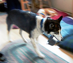
He’d still get nervous when anything changed or he heard loud noises, often grabbing a dog bowl and pacing around with it like a safety blanket:
He was a very sweet dog, and the only one in our yard that would run away from a fight instead of trying to get involved in it. Whenever I’d clean the dog yard, he would follow close behind me, patiently waiting for me to turn around and pet his head. And in the last year, he enjoyed playing with the kittens, pawing at them and pulling them around on the floor (video at the bottom). Every morning when I came down the stairs, there’d be Deuce curled up on a dog bed (he was afraid of going up the stairs). Tomorrow morning will be hard, not seeing his furry ears and bright face looking at me as I come down the stairs.
Rest in peace Mr. Deuce. We love you.

Swamplandia! and Tallys
I just finished Swamplandia!, the first novel by one of The New Yorker’s 20 under 40 list (the author, Karen Russell was born in, gaak!, 1981) about a family of alligator wrestlers in the Thousand Islands region of Florida. Despite that description, it’s a lot less Geek Love, and a lot more non-traditional Bildungsroman. I enjoyed the book, particularly how convincingly the environments of the characters were drawn. The details, sights, sounds and smells of the Florida swamps and jungles, and the unpleasant realities of a low-income job at an amusement park (or really anywhere else):
…the hours contracted or accordioned outward depending on several variables that Kiwi had catalogued: difficulty of task, boredom of task, degree to which task humiliates me personally.
The main character is the girl Ava, who narrates her half of the story in the first person, but I found I enjoyed Kiwi and his struggles on the mainland more. Once the story got going (which for me, was when all the characters had left Swamplandia!) I ripped through it in a couple days.
I hadn’t realized how much southern Florida had been destroyed by a variety of ill-advised Army Core of Engineers projects and non-native species introductions. This book, and Peter Matthiessen’s Shadow Country (which I read in 2009) really makes you appreciate what the place must have been like before humans got around to messing around with it.
I probably should have mentioned this sooner, but my favorite literary event is going on right now: The Morning News Tournament of Books. It’s a tournament-style “competition” where pairs of books from the previous year are stacked against each other, and a literary judge decides between them. It’s always entertaining reading, both in what the judges have to say about each of the books they review and ultimately decide between, and in the commentary at the bottom. Last year’s winner was Hilary Mantel’s Wolf Hall, a book I read last year and highly recommend.
My favorite in this year’s competition is Paul Murray’s Skippy Dies. Alas, it met it’s match yesterday: Jennifer Egan’s A Visit From the Goon Squad. I’m hoping Skippy shows up again in the “Zombie Round,” where losers that may have been unfairly judged get another opportunity to get back into the contest.
Reading what the judge had to say, and the comments, it’s clear that Egan’s book certainly deserved to win as much as Murray’s. Here’s one such comment from John Warner (Anthony Doerr was the judge):
Her books are just very alive down to the sentence level, inventive and surprising, even when you’re braced against them as with the PowerPoint story, which I also approach with a sneer, but was won over by, kind of like my attitude towards Katy Perry, and Jennifer Egan managed to do it without shooting fireworks out of her breasts. (As far as I know.)
But Warner has this to say about Skippy Dies:
Skippy Dies is one of those multi-character, many-threaded novels that manages to hold everything together all the way through to the end. For me, it was the best book of the year, superior to Freedom … The dialogue among the students is the funniest and sharpest I’ve read in years. My investment with the characters is deep and lasting. The title is no spoiler, since the titular character is killed off in the first paragraph. (It’s like Gallagher smashing the watermelons first.) As we go back in time and get to know Skippy and his friends, the heart breaks a little as his inevitable death approaches. Reading it, I got the feeling that Paul Murray put everything he had in the book. No withholding whatsoever.
As it turns out, my favorite book of last year, The Instructions wasn’t in the contest. So I’m still rooting for Skippy Dies.


